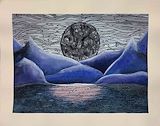
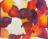
The line work gives the sky a misty and mysterious air, reminiscent of a snow-filled sky. The contrast of the smoothly blended mountains, the segmented sky, and water contributes to the mystique of the work. This work captures the essence of a winter's night in a nearly art nouveau, stain-glass-like style.
- Avani(fan) on March 5, 2024
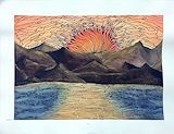
The vibrant colors really capture the essence of a sunset and the way the gradient flows together is very pleasing to the eye. The vibrant sun reflects onto the rough mountains and creates beautiful lighting and depth. The patterns in the sky and the ocean allow for unity to be present in your composition as well!
- Avamarie(fan) on March 5, 2024
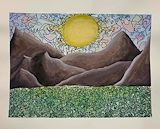
The bright yellow shifting into a darker shade in its circular shape, shines above the big mountains. Seems like summer, the sun beams on the bumpy grass as it rises. The sky displays a variety of colors, they blend so gracefully fitting the awakening of a new day. Lovely work of display.
- Nathaly(fan) on March 5, 2024
The mountains look really cool. The shapes to make the water really add debt and it looks nice.
- Remi on March 5, 2024
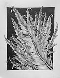
This is a beautifully executed artwork as it has a bunch of different things going on. To start off, I love how simplistic yet complicated this artwork looks. What I mean by this is that although these flowers/plants are in a box, the flowers are drawn with such care and precision. Not only that, but I love how the plants are just peeking out of the box, almost feeling as though they are confined and willing to escape. Lovely art!
- Shruthi on March 5, 2024
The unique approach of how the sharpie divides up the sky and the moon in this artwork is what really caught my eye. The design on the moon reminds me of a cathedral window, but instead of the different colors, it uses value tones, which I find works really well. The soft-looking texture that you gave the mountains works really well with the ridged looking ground/water with the moons reflection.
- Matthew Rowley on March 5, 2024
The line patterns in the sky and grass complement the different hues of watercolor and add a beautiful stain glass appearance. The composition is interesting and has lots of depth between all of the mountains. Additionally, your color palette makes me think of spring because of the pastel colors!
- Avamarie(fan) on March 5, 2024
The lines and patterns that you used in the sky and sea add a beautiful rhythm to your artwork that allows for unity to be present. The different blue hues allows for the illusion of depth and highlights and has a lovely gradation. The moon looks like it is glowing and casting a bright light onto all of your mountains!
- Avamarie(fan) on March 5, 2024
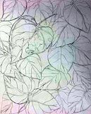
The contrast between the leaves and the object you added create a unique composition. The line work is beautiful and it creates a rhythm in your art that is cohesive throughout. The way that the leaves peak out of the boarder adds a really cool touch and gives the illusion that the leaves have depth.
- Avamarie(fan) on March 5, 2024
I love how you used various hues for the sky such as green, orange, purple, and blue to add more allure to this piece. The use of sharpie on the sky and ground more detail, the intricate designs look like mosaics.
- Hasini on March 5, 2024
I love how the artist made this plant look flowy via your use of line. This artist created movement in the piece and has an interesting composition.
- Hasini on March 5, 2024
I love how you created contrast with the blue and orange hues in this piece and added yellow hues to the mountains to create lighting. The intricate patterns done by marker in the sky and ocean create rhythm and bring life and depth to your painting.
- Hasini on March 5, 2024
I love the use of the sharpie in your piece to accentuate certain aspects and create contrast to the otherwise soft lines of the watercolor. I really like the value tones in your mountains and how the shadows are clearly shown.
- Sana on March 5, 2024
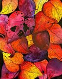
Your composition is beautiful! The vibrant colors of the leaves in your composition stand out, and by using the rule of thirds, your most eye catching leaf pulls the entire piece together, harmonizing the pile.
- Sana on March 5, 2024
This artwork is very visually appealing and has great character to it. I like the different tones of color you used. This really helped pull the piece together.
- Hannah(fan) on January 31, 2024
The warm colors of the leaves are amazing to look at. The holes in the leaves and the unique flow of the lines show bring out the realism in the peace. The negative space allows the leaves to pop out a lot more. Lastly, the graduation of the colors really puts the piece together
- Saina on January 31, 2024
The sense of rhythm in within the leaves really helps to grab the viewer’s attention. The blending of hues within each leaf shows a profound level of strength.
- Iman on January 31, 2024
The overlapping you did with the leaves is very well done and gives a lot of depth. I also like how some of the leaves have holes in them and the lines on the leaves give them an almost weathered look to them.
- Robert on January 31, 2024
The warm colors in this piece blend perfectly together. The yellows/oranges and the red/purples help create some beautiful autumn shades. The perspective of the leaves makes it look like a photograph of the leaves falling off a tree. I also love how the biggest leaf grabs your attention by being the most diverse one with all its holes and tears!
- Matthew on January 31, 2024
The colors in your artwork create a vibrant mood and the different lines of the leaves add a dynamic movement. The balance of colors and shapes was well thought out! I also love the use of line and how delicate all of the details of your leaves are!
- Avamarie(fan) on January 31, 2024
I love the different hues of red purple and orange, I think they all complement each other very well. I think the direction of the leaves helps the piece flow cohesively, and there is a nice balance between light warm orange, and dark purples. The negative space leaves are also very intriguing to look at, and the fact that the largest one resides in the rule of thirds makes the composition more appealing.
- aja(fan) on January 31, 2024
I love the warm and vibrant colors used, and the blending used to transition very smoothly from one color to another. I also like the bigger torn leaf in the bottom left, and how it gives a great deal of contrast between the other “perfect” looking leaves. This makes me really interested to see how this will look when it is finished!
- Matthew on January 31, 2024
I love the way that you used a limited color palette and yet you blended the colors in so many different ways! The vibrant colors make your composition look rich and vibrant. The rule of thirds is also present in your piece and I cant wait to see how it looks completed!
- Avamarie(fan) on January 31, 2024
This artwork looks great, it has good color lighting, good two mixes of the same color, and fine art.
- Angel on January 31, 2024
The shades and hues of the colors add variety and depth to the piece. The blending of the water color adds a beautiful gradient and the colors mix well together. The different sizes and shapes of the leaves adds variety but there are some leaves that look to be the same shape which adds unity. The texture and detail put on some of the leaves adds texture. I notice the sketched veins on the leaves as well.
- Nella on January 31, 2024
The lines on each leaf are really nice and detailed and the rips into the one leaf really gives the piece a front door.
- Samantha(fan) on December 18, 2023
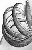
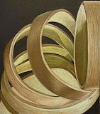
I think you did a wonderful job with shading the rings to create a “light source” that bounces off from it. I also like how you used space to make one of the rings become a focal point of the composition.
- Iman on November 20, 2023
This composition is incredibly smooth, while still having that cardboard like texture, which makes it very realistic and pleasing to look at. The one thing I can’t stop looking at is the perfect edge on the third ring! So beautiful.
- Brittany on November 20, 2023
Looking at your shading and highlighting of the rings as they fall, depth can be clearly observed in this piece.
- Salvatore on November 20, 2023
This art work has some lightening, smoothing, and some details.
- Angel on October 25, 2023
In this composition, space and contrast are used perfectly to highlight the subject, while the colors bring out the texture and depth of the forms. I especially love the placement and color used for shadows.
- Avani(fan) on October 25, 2023
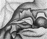
The way you added texture into your piece, makes the cloth pop. The value tones and the hatch work makes the cloth look like a person.
- Charvika on October 25, 2023
I believe that the shadows being cast on the inner parts of the rings are the best part. it creates amazing depth. This piece also reminds me of a caterpillar because of the direction is swoops in. The color combination was also great, my favourite part is the light yellows/cream color for the inside of the rings.
- Valerie on October 25, 2023
I like the gradations of the different shades of brown and the values used to make it look 3D!
- Avamarie(fan) on October 25, 2023
Your artwork shows highlights and shadow very well. I like how there is reflection shown off the bands and how you added a darker value in the middle to the end.
- Charvika on October 25, 2023
Your artwork shows highlights and shadow very well. I like how there is reflection shown off the bands and how you added a darker value in the middle to the end.
- Charvika on October 25, 2023
I really like the shading on this. It goes dark then slowly fades to a lighter shade.
- Nathaly(fan) on October 18, 2023
This composition reminds me so much of Gustave dores art piece “The White Rose”. This is because of the value tones used, they are super similar. It is one of my favorite pieces to look. The only thing that differs is your main use of dark value tones and his main use of light value tones, both magnificent.
- Valerie on October 18, 2023
The technique you used to shade really highlights the value tones pushed in your piece. I also think the various folds and shapes add character and make the artwork very interesting.
- Avamarie(fan) on October 18, 2023
Despite how stylized the shading looks, you still managed to make your subject appear 3D. The value tones seamlessly blend but there is also enough contrast to create depth.
- Hasini on September 27, 2023
You’ve created such an amazing design.
- Gaia(fan) on September 27, 2023
I like the technique and the use of line quality is very captivating. I also love the background and all the shading done.
- sophia on September 27, 2023
The way that you added value tones to the different planes and curves works very well with your piece. The texture that was added to the cloth makes the piece look so alive. Additionally, the pattern in the background makes it look more personalized!
- Avamarie on September 27, 2023
The way that you added value tones to the different planes and curves works very well with your piece. The texture that was added to the cloth makes the piece look so alive. Additionally, the pattern in the background makes it look more personalized!
- Avamarie on September 27, 2023
This piece is very creative. I like how you are able to bring life to a simple study of a cloth. I like how the value tones are expressed in this piece.
- Sana on September 22, 2023
It looks amazing and It is cool the way the details a put in.
- Jason on September 22, 2023
It looks amazing and It is cool the way the details a put in.
- Jason on September 22, 2023
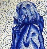
I like how in this art piece, you can clearly see the depth with each indent or wrinkle. The background I find really interesting, in how you were able to keep the same squiggle-like style in the ghost, but you kept different enough to where it is obvious it is still a background. I found it really creative!