Good job on drawing your shoe in a way that it takes up the whole paper. The shading on the shoe creates depth in your composition and makes the slipper look more realistic. I also think that the background compliments the color of the shoe very well, and I love how unique this design is!
- Ayanna on February 11, 2025
The details of the white and blue dots creates a 3 dimensional perspective. The gradient also creates the wave the paper.
- Preet Kaur Kalsi on February 11, 2025
The smooth shading and careful details on the ballet flats, makes it look elegant and soft. The darker pink tones adds depth and makes the artwork feel more realistic and complete.
- Brooke on January 26, 2025
Your artwork looks really good. I like how you can see the textures of the food well and how bright everything is. You can also see the different values of colors on the foods, like the strawberries and oranges. Everything goes together so it creates unity which is nice.
- Ashley on January 21, 2025
Your use of bright highlights emphasize the high and low points. Your use of cool tones in the palette shows maturity.
- Loukya on January 21, 2025
The seemingly single medium used to create value to form the shoe is true talent. The contrasted color is enough to create shape and detail beautifully.
- Kat(fan) on January 14, 2025
The entire composition is well done, specifically the dip in the top right corner. You did a good job at pushing your shadows to make a textured dip instead of it just laying flat.
- Megan on January 10, 2025
The simplicity of the artwork enhances it even more, with the nitty-gritty details not overpowering it. I admire how this art has so much detail but still has some simple characteristics. The shading is very realistic and the fruit was drawn very well!
- Ayanna Chugh on January 7, 2025
Your well-executed shading really made the bubble wrap come to life. You realistically drew each individual bubble on the roll, which requires a lot of time and focus, so great job! I also enjoy how use used a monochrome theme of blue.
- Ayanna Chugh on January 7, 2025
This artwork shows a wavy, ribbon like form with a textured, bubble like surface, rendered in shades of blue and white. This creates a sense of depth and movement.
- Vivaan on January 5, 2025
I like how you use texture alongside the value tones to create depth and make it look 3D. I also like the use of tints to create contrast with the roll and background, it appears very planned out.
- Elizabeth(fan) on January 2, 2025
I like the variety of colors, it makes the piece very appealing to look at. I like the use of value tones to show form as well
- Vivaan on December 19, 2024
I love the texture on this due to the bubbles. Additionally the value tones successfully show a sort of shiny, plastic like texture.
- Vivaan on December 19, 2024
I love the way the colors blend so well. Creating each and every bubble must’ve been tedious but the results are worth it!
- Eve on December 19, 2024
The design and layout gives this piece unity. Adding shading to it would give it better contrast and make it more realistic and layered.
- Ashlyn(fan) on December 19, 2024
The texture and value makes this drawing look very realistic. You did a good job using form to give this piece dimension.
- Ashlyn(fan) on December 19, 2024
This piece is so realistic! I love the contrast between the light blue and darker blue, and the ombré styled background. The shadows of the dots on the bubble wrap make it look so realistic and popable. I also like that you highlighted parts of the bubble wrap, it added emphasis to the piece. The texture looks real, and the color scheme throughout the piece gave it unity.
- Deena(fan) on December 19, 2024
The blue and white shading behind the actual drawing makes the art work stand out and it makes it uniques!
- Luke(fan) on December 19, 2024
You did an excellent job including texture on the drawing. It makes the drawing pop out.
- Sri on December 19, 2024
The amount of organic shapes in the foreground make the layering of the food very unique. The various contrasting colors from the red to the green, from the purple to the yellow make it very eye catching.
- Charvika(fan) on December 19, 2024
The cool toned hues add maturity to the piece. The vibrancy and saturation gives a playful effect.
- Loukya on December 19, 2024
The unity and variety portrayed in your artwork combines different textures and colors, making your artwork very visually pleasing, giving it wonderful harmony and rhythm. Your shading, highlights, and contrast adds depth and balance to each food item you have on your charcuterie board, making your overall composition very beautiful and cohesive.
- Michaella on December 19, 2024
The various usage of color brings out a sense of contrast and balance between each food item. The value of each piece of food, creates a sense of depth and motion as well.
- Hayden on December 19, 2024
The crowded looks adds balance and emphasis since the items blend with each other but emphasizes what is what. The bright colors make it look more lively across the whole piece.
- Chandani on December 19, 2024
The detailed coloring on the meat and other red tones in the piece draws my eye to the vibrant and clearest parts. The shading of the dip also draws my eye and is very life like.
- Mckenna B. on December 19, 2024
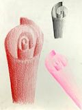
The shading on your paper rolls was done exceptionally well, allowing no lines to show. Due to this, the rolls look 3-D and the colors are very pretty and vibrant, contrasting well with the plain black background.
- Ayanna on December 19, 2024
The shading on your paper rolls was done exceptionally well, allowing no lines to show. Due to this, the rolls look 3-D and the colors are very pretty and vibrant, contrasting well with the plain black background.
- Ayanna on December 19, 2024
I like how neat the rolls look! Theres no outline and the values look amazing! It looks pretty realistic!
- Deepti on December 19, 2024
Shading style is nice. I also like the color palette.
- Vivaan(fan) on December 19, 2024
I really love the color in your artwork. The letters being 3D makes it even more creative.