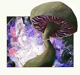
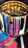
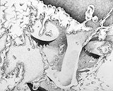
In this painting, the mushroom extending beyond the border created adds personality to the artwork. The color scheme of purple, pink, blue, and white, used in the background creates unity.
- Dhruvi on March 30, 2025
The colors of the background and the colors of the mushroom provide good contrast. The mushroom exceeding the background is thinking outside the box
- Ashlyn on March 30, 2025
Your use of light, shadows, and color between the different hues of purple to the white and black makes your artwork very aesthetic and adds dimension and depth to your piece. Furthermore, the blue, purple, and white brush strokes in the background add texture and quality to your piece, showcasing a sort of movement and energy. Lastly, the contrasting colors against the different colored stroked background create a dramatic look, making the mushroom stand out as the focal point.
- Michaella on March 30, 2025
The artist’s use of swirly pattern and bright hues in the background contrast with the depth and muted tones in the mushroom. There is an interesting component with the pop out extending off of the base, making the focal point stand out more. The artist creates unity with accentuating the purple in the background in the values of the mushroom.
- Loukya on March 30, 2025
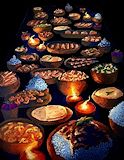
In your piece of artwork, the warm, inviting colors and the repetition of the bowls create a sense of rhythm and balance throughout your composition. The rich textures of the food and the glowing candles throughout your artwork draws my attention and emphasizes what you are trying to portray through your artwork. Your artwork shows great aesthetics through its captivity, feeling of warmth, comfort, and abundance.
- Michaella on March 30, 2025
Your piece is very life like and gives an organic feel, the colors chosen really make it pop and gives the illusion its glowing, this is an amazing piece
- Alexa on March 30, 2025
This drawing has very good dimensions and the coloring is amazing
- Reeva on March 30, 2025
The coloring on the effect of the artwork to the silver tin looks really realistic and nice
- Reeva on March 30, 2025
The towel details looks amazing and looks very realistic
- Reeva on March 30, 2025
I like the amount of diffrent colors and texture on the food
- Reeva on March 30, 2025
Your composition looks cool. I love the vibrant colors used and the texture of the mushroom. The background colors and the color of the mushroom compliment each other well so the whole composition looks very united.
- Ashley(fan) on March 30, 2025
The drastic contrasts of value tones adds on to the theme of your artwork, especially with the sense of lighting using warm tones. Your perspective is also exceptional through creating a sense of rhythm. The contrast between cool and warm tones aids with the appeal of the dishes.
- Iman on March 30, 2025
I love the use of dark and light like the highlight of the yellow give the look of fire in the lamps. The details of this peace and how you created the illusion of the entire table.
- Preet Kaur(fan) on March 30, 2025
This looks like it took a lot of time to get made. Which makes it very good everything about it looks realistic and amazing.
- Diego on March 30, 2025
I really like the way they used the background and went with the black and made it look like they were eating at night time and I think it looks really good. The shading and the depth of the coloring is so good. The coloring of this is so good. It really draws me in. If I could take a guess at what the entry point of this work is I would say the candles, because those are what brought me into this piece of artwork. I really enjoyed looking at this and I think it’s really beautiful.
- Reilly on March 30, 2025
This artwork is colorful and detailed, showing lots of different foods that look really realistic. The warm colors and bright highlights make the food look stats and make the picture feel welcoming.
- Isha on March 30, 2025
This is so cool. The way the use of black space allows for a sort of illusion and everything is floating in the air. The use of detail is so prevalent here and its well thought out each dish has great detail and it actually looks like its glowing, so nice!
- Siyaana on March 30, 2025
I love the composition for this and the use of lighting and color. In a way, this work demonstrates leading lines which is really nice.
- Vivaan on March 30, 2025
The bold colors and geometric shapes create a vibrant and dynamic composition. The black stripe and outline on the bowl’s white bottom provide a sharp contrast, emphasizing the form and texture. The use of lines and patterns add rhythm and movement to the artwork.
- Avamarie(fan) on January 20, 2025
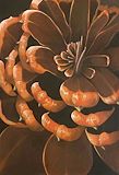
The vibrant oranges in the pinecone create a striking contrast against the dark brown background which shows the pine ones form. The use of color and value enhances the focal point, drawing the viewer’s eye to the center of the pinecone. The texture and detail in the pieces of pinecone add a sense of realism and depth to the painting.
- Avamarie(fan) on January 20, 2025
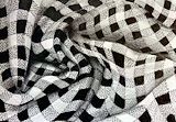
The intricate woven pattern of the checkered fabric is fascinating, showcasing a balance of texture and form. The play of light and shadow on the crumpled surface adds depth and a three dimensional effect. The repetition and contrast of the tightly woven squares create a dynamic and visually engaging piece.
- Avamarie(fan) on January 20, 2025
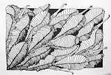
The details of the overlapping leaves are captivating and the textures and patterns gibe the drawing a sense of depth and realism. It’s impressive how you managed to create such complexity with only black and white lines from the sharpie. The contrast between the leaves and the sharper object are also visually appealing.
- Avamarie(fan) on January 20, 2025
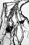
The intricate details of the intertwined tree roots in the upper right portion are mesmerizing. The abstract nature and flowing lines give it a sense of movement and depth. It evokes a feeling of connection and complexity which makes it engaging.
- Avamarie(fan) on January 20, 2025
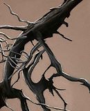
The intricate details of the three branch and roots are beautifully captured with the charcoal. The contrast between the dark lines and the light brown background create a striking visual effect. The texture and realism of the wood are impressive, making this a compelling and well-balanced piece.
- Avamarie(fan) on January 20, 2025
The vibrant colors of the flower against the deep blue background create a striking contrast that draws the viewer’s eye. The thin, dark green stalks add movement and guide the gaze around the composition. The central placement of the flower and the balance of surrounding elements make it the focal point, creating a harmonious and visually compelling piece.
- Avamarie(fan) on January 20, 2025
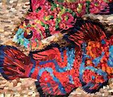
I really like the artist's use of patterns to create this composition. In addition to the patterns displayed on the fish, the background or water also has a pattern. I think this adds to the piece and with the dark shadow on the fish on the bottom, it allows the piece to pop and have dimension despite the difficulty of the medium!
- Joey(fan) on January 20, 2025
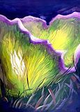
This drawing utilizes vibrant, flowing lines and colors to create depth and movement. The background uses purple and green to emphasize texture and rhythm, make the composition visually engaging.
- Vivaan on January 20, 2025
The vibrant colors and contrast are so appealing to look at. Creating mushrooms as natural beauty is very creative and the piece is great overall.
- Eve(fan) on January 20, 2025
I love the color choice. Additionally I love the use of value tones in the middle/ the light emphasis.
- Vivaan on January 20, 2025
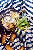
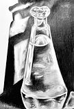
The artwork skillfully employs color, contrast and texture, with the vibrant green glass and the warm tones of the squash standing out against the cool, striped, background. The use of rhythm through the repetitive lines of the cloth and careful shading creates depth, while the shapes and reflective surfaces add balance and visual interest to the composition.
- Avamarie(fan) on January 20, 2025
I love the perspective and contrast of colors used, it really brings out the piece as a whole. The bottle especially is well done with its different values of green.
- Kat(fan) on January 20, 2025
Your artwork is very visually pleasing to look at. The contrast between the colors and shadows gives it a lot of depth.
- Ridhini(fan) on January 20, 2025
I really like this piece. My attention is drawn to how the artist implemented an expected border due to the dark values found behind the subject matter (the leaves) however have the subject batter flow off this implied border. I also find the contrast of the leaves to be very strong due to the additional close lines representing the darkest parts of each leaf.
- Joey(fan) on January 20, 2025
This is really good! Your usage of colors to add dimensions and value is amazing as well as your choice of color to get the right hues for this vision.
- Siyaana on January 20, 2025
I LOVE this piece, there is so much movement and the different lines creates texture.
- Alyssa(fan) on January 20, 2025
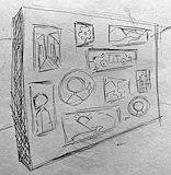
The form of the object helps emphasize the design and creates unity and proportion.
- Hayden on January 20, 2025
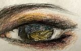
I enjoy the picture inside of the actual eye since it creates an interesting picture compared to a normal eye.
- Chandani on November 13, 2024
I love how you put art in the eye
- Madyson on November 13, 2024
The gradation between the dark and light shades of gray create a sense of roundness. The highlights and shadows show clearly where your light source.
- Avamarie(fan) on November 13, 2024
I love how you put art in the eye
- Madyson Palmieri on November 13, 2024
The sharp contrast between the lights and the darks creates a sense of depth and reflection. The gold hues add a nice hue to your colored pencil drawing overall. The colors also create emphasis against the dark background.
- Avamarie(fan) on November 13, 2024
The contrast between the light and the dark tones create a deep sense of depth and makes the folds look very realistic. The folds are lying on top of each other in a graceful way, creating rhythm.
- Avamarie(fan) on November 13, 2024
I love how you used the rule of thirds to create this piece of artwork. I also love the depth created with the hatching and dotting. The different pathways almost feels like a tunnel and the depth and as well as the different irregular.
- Asha Patel on November 13, 2024
This image is really cool. It is truly amazing how you created the 3D aspect of this image seeing the up down left and right and even some of the back of the image. I really love the hatching work done on the object and the more object closer to the view are darker because they are more visible, and the objects further are less hatched since they wouldn’t be visible.
- Asha Patel on November 13, 2024
I love the dotting of this image especially the light to darkness is amazing. I love the depth into each blob it creates and the shadows.
- Asha Patel on November 13, 2024
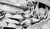
I love this piece of work. The illusion it creates for views is amazing. I feel as if I am seeing a canyon in the back of different type of neutrals and then in the front i see vibrant colors drawing a picture. I love how you can see the depth of this project.
- Asha Patel on November 13, 2024
I love this piece of work. The illusion it creates for views is amazing. I feel as if I am seeing a canyon in the back of different type of neutrals and then in the front i see vibrant colors drawing a picture. I love how you can see the depth of this project.
- Asha Patel on November 13, 2024
I love this piece of work, the Shading gradient going from light to dark and the crosshatching depicted is amazing. I look the dotting work and well and the symmetry of each object.
- Asha Patel on November 13, 2024
This piece of artwork is very creative. I feel as if I am being engulfed into some type of hypnosis. When I observe the artwork more closely, the texture of the dotting coming together to create a darker shade and the more spread out it becomes the less dark it is, is really cool. I also love how the lines actually feel they are being pushed it the way they are.
- Asha Patel on November 13, 2024
The texture of your work through your medium of choice is really appealing. You also excelled with establishing form while still maintaining the reflective aspects of the glass.
- Iman on November 13, 2024
You did a profoundly great job with the grounding of the golden bowl. Additionally, the composition of the bowl’s reflection captures the attention to the center of your work. The form was also exceptional through your use of contrasting value tones.
- Iman on November 13, 2024
The artist only used the black and shade of gray and white to create an illusion of the fabric being crumpled up and wrinkled. They achieved this illusion by shading different parts of the fabric in different ways. Along with this the artist used different lines instead of all straight lines to make the fabric seem crumpled. The artist only used the black and shade of gray and white to create an illusion of the fabric being crumpled up and wrinkled. They achieved this illusion by shading different parts of the fabric in different ways. Along with this the artist used different lines instead of all straight lines to make the fabric seem crumpled.
- Anika on November 13, 2024
The value in your artwork is really nice and I like how you portrayed texture!
- Michaella on November 13, 2024
The depth and different types of textures used to make this is incredible. The shadowing of the soccer ball is m y favorite.
- Asha Patel on November 13, 2024
I love the contrast of the color in the columns. Inside the structure i feel like it looks like a sunset, a the color contrast between the colors and blending is really nice.
- Asha Patel on November 13, 2024
The value tones in your study create a strong sense of depth that increases the believability that this object is both transparent and 3D. Additionally, the extreme darks next to the extreme lights create a really good source of space.
- Avamarie(fan) on November 13, 2024
This work of art is truly amazing to look at. The different colors in the fish flow very nicely together, and the texture of the dots in amazing. I also like the choice of the background colors, they are monotone to let the fish speak for itself and being the main center of attention.
- Asha(fan) on November 13, 2024
This art piece is very colorful and art style is very unique.
- Dhruvi(fan) on November 13, 2024
Using the pieces of paper really added a pop of color to the fish
- Isha(fan) on November 13, 2024
I love the couture demonstrated on this piece of art. I also love the shading and how it shows the emotion of the art. The brightness to the darkness is truly incredible.
- Asha(fan) on November 13, 2024
I love all these different patterns and colors! It adds a lot of depth to your piece.
- Aashna(fan) on November 13, 2024
The value and shading used creates a great contrast between more highlighted and darker areas of the face. In addition the stippling that was used adds texture onto the skin and the piece.
- Saanvi(fan) on November 13, 2024
The composition sticks out the art work is very warm and light.
- Angel on November 13, 2024
Your use of complementary colors in your artwork communicates the Contrast and balance you were attempting to portray very well, as well as the neutrals for the background which don’t feel out of place but also don’t take away from your main subject matter. The directions you chose for the fins worked out nicely after your struggle with trying to unify them, however have you considered how these fish influence the space around them. Your background is in one direction but when fish swim the water around pushes past them and changes direction from stillness, something to think about if you truly want to push movement and motion in your piece even further.
- Sahil on November 13, 2024
This artwork of two fish swimming contains lots of vibrant colors that have nice contrast. The red/orange and blue fish alongside the pink and green fish work together nicely, as the base color combinations. I like the use of texture in the scales to make the fish come alive, as they both look shiny and realistic. The rule of thirds is being used well too, as I find the eye of the pink fish in the top left hand corner works well as an entry point.
- Matthew on November 13, 2024
Your craftsmanship is very apparent in this piece and it is obvious that it was very time consuming. The value tones in the fish are so beautiful and blend so well together. The different shapes of your magazine pieces enforce the direction that they are going in. The piece is unified by the incorporation of similar sized fins for both of the fish. Lastly, the eye in the pink fish has emphasis on it since it’s so different from the rest of your piece, yet it still works so well with your composition!
- Avamarie(fan) on November 13, 2024
The value tones in this artwork are incredible, with the pop of bright and cool colors, the fish stands out further. The organic flow of little pieces tie everything together, with all the pieces going the same direction and are the same size.
- Saina(fan) on November 13, 2024
The detail in this artwork with the rushing water as if it is coming from a faucet gives a tranquil atmosphere to person in the painting. I imagine the rushing water with her eyes closed gives her a sense of inner peace and focus. The droplets enhance the composition, giving it emotional depth, as one could perceive the droplets as tears as well.
- Matthew on November 13, 2024
The details added in creating a self portrait are applaudable. I like the addition of water and different values. I also enjoy the detail of making the main features bolder than the rest of the piece.
- Shreya on November 13, 2024
This piece plays on the viewers eyes by thinking individual dots, stippling in this case, create a seamless portrait. The head is using realism while the eyelashes are almost cartoonistic. The composition is created with a middle texture without going to far dark or light.
- Gianna on November 13, 2024
The gradients in your piece add a layer of depth to your work and really make it look 3D. I love the addition of the bathroom tiles because they create a story in your artwork. The movement of the water droplets catches the viewers eye and create unity throughout the entire piece.
- Avamarie(fan) on November 13, 2024
The values created in this style are rich, dramatic and yet smooth. This style perfectly captures the transparency of water and the interactions between the water and subject. The rhythm created by the clusters of dots brings life and movement to this piece.
- Avani(fan) on November 13, 2024
The distance between your dots are so even and precise that your value tones fade together so smoothly. The water droplets were very well done and show a clear gradation from dark to light. The composition of your piece is very interesting and my eye is immediately drawn to the water droplets which have a lot of movement.
- Avamarie(fan) on November 13, 2024
The subtle and harmonious value tones of this piece create a visually pleasing atmosphere, which really draw me in. I love the use of stippling to add depth.
- Sana on November 13, 2024
The shading provides texture and depth. Also the shading looks really good and I like how the shadows are all unique and different.
- Connor on November 13, 2024
There is a lot of rhythm shown throughout the piece through the use of the contrasting tones and the different values. Furthermore, a bumpy but smooth texture is portrayed. The curved and diagonal lines show the flow of the artwork and therefore show immense realism. Amazing job!
- Saina on November 13, 2024
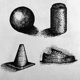
There is a lot of texture shown throughout this artwork like a bumpy, and prickly texture shown in the cone and the can(probably because of the stippling). However the sphere looks like it would have a smooth surface. There is amazing depth shown throughout with the use of shadows.
- Saina on January 20, 2025
I like how dark the dark values are in contrast to the very white or lighter values. Furthermore, these sketches look very realistic and are done very neatly.
- Amal on January 20, 2025
The contrast between the objects and the leaves grab the viewers attention and balance the composition since they complement each other. The use of negative space brings out the line work. Additionally, the rhythm of your line work is consistent and precise.
- Avamarie(fan) on January 20, 2025
I really appreciate how you did different techniques to show value. For each object you drew it is very clear where the light is coming from and very well done.
- Robert on January 20, 2025
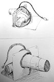
I think both are incredibly detailed, i especially like how the shading on the first one came out . I think the value shift on the cord supplies a nice contrast in comparison to the lighter background. You also did a great job at making sure all the objects were proportionate.
- aja(fan) on January 17, 2024
I absolutely love how vibrant and lively your highlights are. The yellows and whites in the highlights almost make the edges of the pinecone leaf look glossy. My eyes were immediately drawn and stuck to the different hues of firey orange, and bright yellow. I love it; it looks like orange jello?? The different value tones, and uses of blacks and dark browns create nice depth and realism.The composition is overall very smooth, neat, and clean.
- aja(fan) on January 17, 2024
I love how unique your shading is to you. You're doing different techniques in all of them, but you can very clearly tell that they're all being done by YOU. I really like the hatching on the shoe, especially the background and cast shadow. The texture from the crosshatching makes the piece so much more realistic, along with the value tones which create depth. The stippling on the can is also really enjoyable to look at, it looks like it feels like TV static.
- aja(fan) on January 17, 2024
The deep contrast in your piece attracts the viewers eye. Additionally, the different lines add contrast and texture to your artwork. The use of positive and negative space create unity and balance.
- Avamarie(fan) on January 17, 2024
You can very clearly see the shift and gradation in tones throughout the entire sheet. As the value decreases a sense of texture erupts through the different shading patterns. I especially enjoy the texture and toughness of the crosshatching. It looks as though the paper itself feels like how tv static looks.
- aja(fan) on January 17, 2024
You did an excellent job with the shading overall. The hatching in the first drawing enforces the realism factor. Not only that, the style of shading proves a unique element of texture especially on the electric cords. The propositions of the first one are super balanced and parallel as well. You did a very good job at capturing the object.
- aja(fan) on January 17, 2024
The cross hatching disguised the originally outline of the circle and turned it into a sphere with many different values. Additionally, the scribbles that you used to add value tones on the can was a very creative approach and worked very well! The hatching you added to the shoe makes it look much more interesting. The shadows that are casted from the objects also make them appear more life-like.
- Avamarie(fan) on December 15, 2023
Your emphasis on light source and a cast shadow creates a sense of realism for each texture. The texture for each line work really does a great job at creating a third dimension that makes each shape stand out. I especially think the texture(presumably either scribbling or using words) of the can gives it an enchanting appeal.
- Iman on December 15, 2023
The depth created by the shadows is rather intense. The depth created around the soccer ball is what I notice most.
- Erich on December 15, 2023
I love how you use cross hatching to show extreme contrast and value tones!
- Hasini on December 15, 2023
I really like the use of uneven lines to portray leaves in such a stylized way
- Hasini on January 17, 2024
This composition has many different value tones that show a clear distinction on where the light source is hitting and where the highest points are. Well done!
- Gianna on December 15, 2023
I like the highlights on the edge of each branch because it draws my eye to it.
- Sophia Awwal on December 15, 2023
This piece is very eye catching and engaging. The colors and the shading add value to this piece.
- Mirsada on November 20, 2023
Wow, the detail in this piece is amazing, truly shows the depth and contrast in the pinecone.
- Samantha(fan) on November 20, 2023
The contrast between the light highlights and the dark shadows draws the viewers attention. The earthy brown tones are very vibrant and add to the contrast of the piece. Additionally, the detailing in the piece uses the rule of thirds and makes your artwork look very interesting!
- Avamarie(fan) on November 20, 2023
The values you used add the realistic approach to your pinecone. You did a great job with contrast as some parts of the pinecone look smooth whilst others appear more rough.
- Hannah(fan) on November 20, 2023
The values you used add the realistic approach to your pinecone. You did a great job with contrast as some parts of the pinecone look smooth whilst others appear more rough.
- Hannah(fan) on November 20, 2023
Great detail on the edges of the pinecone. Looks like a 3D image.
- Alexander on November 20, 2023
this piece portrays a lot of detail, the pinecone looks 3D
- devin on November 15, 2023
After reading your statement I came to really like the title of your work. I also like how the leaves “come off the page” and are hanging.
- Robert on November 15, 2023
The lines you used to give value to the roots are very well done and varied to give more texture. Looks really good.
- Robert on November 15, 2023
I really like the shading you have in the pinecone, because in your statement you said how the viewers eyes are drawn toward the ends of the pine segments and that's exactly what happened to me as well.
- Robert on November 15, 2023
There is a sharp contrast between the dark and the light. There is also value and texture which really emphasizes the piece. The realism shown throughout the picture intrigues me.
- Saina(fan) on November 15, 2023
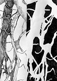
The hatch crossing on the left side helps create a bark-like texture for the composition. I also like how well you mirrored the positive side into the negative.
- Iman on November 15, 2023
The shapes are very beautiful and can allude to seeing more than one image at a time in this piece.
- Sophia on November 15, 2023
The black background creates contrast between the leaves. The way you added stems hanging off the side of the piece adds this realistic feature. It really draws the eye and the different textures you added creates contrast.
- Nella on November 15, 2023
The positive and the negative sides really show the different perspectives to view the weed. The patterns of lines and dots used in the positive side brings out the realistic side of this piece. Lastly, the movement is shown through the flow of the weed structure.
- Saina(fan) on November 15, 2023
Your object not only creates an appealing balance between the leaves, but also makes for great variety in line structure. Some of the lines on the leaves also create an interesting 3d like effect on the composition.
- Iman on November 2, 2023
I like how you used a variety in value tones to create a 3d illusion for your crumpled paper
- Iman on November 2, 2023
The way that the corner of your artwork has the lines closer together creates the illusion of value in your piece. I also like the different gradations you used and the contrast throughout your piece.
- Avamarie(fan) on November 2, 2023
The way that the corner of your artwork has the lines closer together creates the illusion of value in your piece. I also like the different gradations you used and the contrast throughout your piece.
- Avamarie(fan) on November 2, 2023
This piece is genius because the composition extends the set boarder creating an effect that the images are 3D and protruding outwards. The leaves have a seamless rhythm that flows together and creates unity.
- Gianna on November 2, 2023
The extreme contrast makes your artwork look very alive. Additionally, I like the way you added highlights to make all of the parts of the weed look like they’re overlapping each other.
- Avamarie(fan) on October 10, 2023
The values of the piece are well defined from the bright-white highlights to the deepest of shadows; they give the work palpable texture.
- Avani(fan) on October 10, 2023
The cross hatching really helps show the crunches in the paper.
- Kyle(fan) on September 28, 2023
The way you pushed the extreme blacks and whites of your piece was done beautifully. The crosshatching technique you used to create different values really creates the effect of crumpled paper.
- Angelina(fan) on September 28, 2023
The fact that there’s no color in this piece yet the contrast between light and dark is so clear. Additionally, the value tones have such a large range, meaning the darks are so dark and the lighter tones almost look white.
- Amal on September 28, 2023
The extreme contrast added via cross-hatching and sometimes by entirely blocking in the shadows gives the piece a tangible texture and makes it seem like the shapes are popping out of the page.