I live the detail. Especially in the eyes. There is details in both the eyes and the mouth and a solid background to not take focus away from the main art.
- Zaya on February 5, 2025
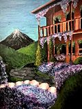
This whole drawing is very realistic and I love the florals and details that was put into this.
- Zaya on February 5, 2025
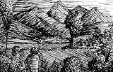
The floral movement prominent throughout your work aids in attracting the audience to the landscape. You crafted the architecture in an astute way that creates a sense of stability. The contrast between hues balances the mood of your artwork.
- Iman on February 5, 2025
This piece has a very strong sense of perspective, which is complemented by the negative space created by the hills and sky. It brings a lot of emphasis to the house and garden, which itself has a very strong sense of light and value. The stippling/feathering used to make the flowers allowed for a very beautiful layered gradient look that makes important parts of the piece pop, alongside how the bright pinks, purples, and blues create contrast with the natural browns and greens of the rest of the piece.
- Elizabeth(fan) on January 29, 2025
Your artwork looks really beautiful. I like the value tone changes on the hills, stones, mountain, building, and the flowers. The value tone changes create depth, which is also nice. I also like how the lightness of the sky helps emphasize the mountain and building.
- Ashley on January 29, 2025
The gouache was used wonderfully and gives this piece texture. The small details give your composition unity.
- Ashlyn on January 29, 2025
I love the way your artwork shoes a variety of colors and value throughout the piece and how the flowers have texture, which makes it realistic. Additionally the colors balance with each other nicely with adds to the wonderful artwork.
- Chandani on January 29, 2025
This piece of artwork is so amazing. I love the way you emphasized the flowers and how they go all around the house, but my favorite part is the mountain. That is what drew me into this piece of art work. The texture of the rocks and how they form is so beautiful to me. The structure of the house it also really pretty to me I like the coloring of this. The road to walk up to the house is so good everything about this piece of work is amazing.
- Reilly on January 29, 2025
Wow this drawing is amazing it has a lot of colors to it and the way the mountain looks far way back from the house is amazing and realistic very nice.
- Diego on January 29, 2025
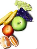
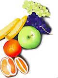
This artwork is beautifully realistic, with detailed textures and vibrant colors that make the fruit look lifelike. The highlights and shadows create depth, drawing attention to the careful composition and making it a visually striking piece.
- Isha on January 29, 2025
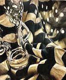
This artwork looks realistic with all its patterns and textures that make it so interesting to look at. The black and white design makes the shapes stand out and give it a really bold and creative feel.
- Isha on January 29, 2025
The use of contrasting colors and the intricate details in the fabric really make this piece stand out. The way the black and white stripes interact with the dots from the colander adds a dynamic element to the composition. The overall effect is both striking & elegant.
- Charvika(fan) on January 21, 2025
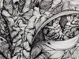
Throughout this drawing there is various elements and principles being expressed like shape,texture,pattern,balance, etc. it gives a very realistic feel to it you did an amazing job creating this spiral fabric effect it looks just like a picture!
- Alexa on January 11, 2025
I like the simple color palette that gives the piece a sense of cohesion. I also really like the shape and color used to create form through light. It creates a mystical atmosphere through the gold.
- Elizabeth(fan) on January 11, 2025
You did a good job using dark color to push your shadows. The dark shadows create good contrasting mailing a good emphasis on the part of the composition that the light is hitting.
- Megan on December 18, 2024
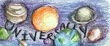
The contrast between the planets and the background adds to the piece by making it stand out and more realistic. I enjoy the way the words add movement to the piece so as you read them you feel like you’re going through the planets.
- Chandani on December 17, 2024
The drawing of the black and white blanket captures a rhythmic pattern, where the alternating squares create a sense of unity across the surface. The flowing lines and soft folds in the fabric convey a gentle movement, allowing warmth and comfort into the piece.
- aarya on December 17, 2024
The hatching is very creative!
- Luke on November 21, 2024
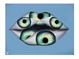
I love the highlights in the eye as it allows you to see where the light is aiming and the repetition aims for an illusion
- Preet Kaur(fan) on November 21, 2024
The gradation of values creates depth and space in your composition.
- Avamarie(fan) on November 21, 2024
I LOVE the creation of Adam painting, the colors and light source drew me in.
- Alyssa(fan) on November 15, 2024
The composition is eye catching because of the various folds. There is also sharp contrast between the lights and the darks and there is a smooth rhythm to the piece.
- Avamarie(fan) on November 13, 2024
The texture in the fabric is really well done, making it feel more realistic. The shading in the folds adds depth, which makes the artwork look even better.
- Brooke Parfitt on November 13, 2024
The composition of this piece draws your eyes to the center — I like how it’s a spiral. The high contrast definitely pushes folds of the cloth.
- Hasini on November 13, 2024
The unconventional composition and the dark value tones enhance the piece. The high contrast on the bottom of the bowl definitely pushes the illusion of a reflection.
- Hasini on November 13, 2024
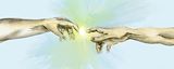
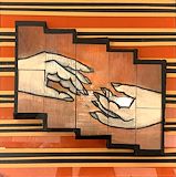
Your artwork looks really good. It’s very balanced. I like how theres value in the background. The light where the hands are pointed to looks really emphasized since theres yellow around the white circle in the center.
- Ashley on November 13, 2024
Your artwork looks really good. It’s very balanced. I like how theres value in the background. The light where the hands are pointed to looks really emphasized since theres yellow around the white circle in the center.
- Ashley on November 13, 2024
This piece of art looks satisfying to look at. I can see that there’s depth and different values to the eye. And there’s a consistent pattern of eyes, which looks really cool.
- Ashley(fan) on October 29, 2024
I like how this piece of art has a lot of depth. The different values within the art helps show that. I also like how there is a lot of detail. Overall, looks great.
- Ashley(fan) on October 29, 2024
I like how you created texture in the cloth. This piece of art looks great. I also like the shading within the scrunch shows depth.
- Ashley(fan) on October 29, 2024
I love the way some of the lines are shaded perfectly then there dotted and no shaded.
- Luke on October 29, 2024
I like the way you used the contrast and texture in order to emphasize the scrunched up form of the cloth. It looks nice.
- Elizabeth(fan) on October 18, 2024
The use of colors was applied well in this piece of art. Also, I liked how you included multiple planets to align with the theme of “universal.”
- Dhruvi on October 16, 2024
Your emphasis on universally is done very well and the actual drawing of the universe is very visually pleasing.
- Benisha on October 16, 2024
The shading on this art piece is blended in the background perfectly
- Vivaan(fan) on October 16, 2024
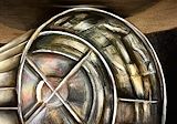
The interior of the trash can has lots of depth and detail to it, lots of stuff going on in there.
- Dhir on October 2, 2024
Very well done, I love the color contrast between the planets.
- Kat(fan) on October 2, 2024
My favorite part about the artwork is how realistic the drawings appear, as well as the dark tones from certain fruits, like the grapes and apples, that create a sense of depth.
- Kahan(fan) on September 11, 2024
This beautiful artwork is blended very well and makes the fruits look realistic
- Sahasra Singireddy on September 11, 2024
Your composition of this piece and contrast of color are comforting and calming to look at. You did a great job executing the texture look as well.
- alexandra(fan) on September 11, 2024
I feel as thought the artist did a great job in using a various amount of medians to form this piece and supplied a satisfying amount of depth into this work.
- alexandra(fan) on September 11, 2024
I feel as though the artists did a great job in using a various amount of medians to form this piece and supplied a satisfying amount of depth into this work.
- alexandra(fan) on September 11, 2024
The detailing and fine lines in the drawing attract the viewers attention. The intricate design was mesmerizing.
- Jorden(fan) on September 11, 2024
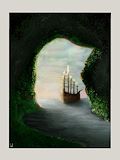
The perspective of the artwork gives the viewer a sense of satisfaction. I believe they achieved their idea with the way they positioned the boat in the lighting and frame of the cave.
- Jorden(fan) on September 11, 2024
This piece of art has light colors and the balance of colors is just perfect.
- Vivaan(fan) on September 11, 2024
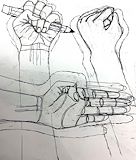
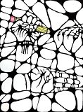
I like the pattern you used as your background, I think it makes the center of your artwork really pop. I also like the different values you used when making the hands, making it look realistic.
- Hannah(fan) on November 28, 2023
This piece of artwork is so amazing! I really look how comprehensive and well done this is. It looks very naturalism. Also, it shows a lot of 3D. The colors you used really pop out and it all fit so well together.
- Yecenia on June 22, 2023
I really love the way you started and ended your artwork. The comprehensive on your artwork are so well done. I can tell how you manipulated your inanimate object. The roar looks very naturalism and 3D.
- Yecenia on June 22, 2023
love the way the shadows look as well as how you used them. The strokes happen to be nicely placed the right way as well as the right shades that belongs to brown/yellow makes it really pop as well as come to life.
- natalie(fan) on June 16, 2023
The movement of the hands is seen throughout this artwork. The line work clearly shows the motion of the hands. For example, the hands holding the pencil are clearly scrunched together to show that it is holding the pencil. The curved lines show how your palm looks when holding the pencil.
- Kayla(fan) on June 8, 2023
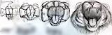
I enjoy how you have balanced the tigers head and created the composition of it through shapes. Watching the shape of the head come together through your process was really interesting. As you drew you can see the details you added to the head, like the fur and shading of the head. In the back of the mouth you can see there is a gradient as it gets farther and farther back into the mouth.
- Kayla(fan) on June 8, 2023
I really like how this piece utilizes shading and coloring to give the wolves a 3d and hypnotic effect. The texture that the wolves hair creates is extremely realistic and adds a lot to the piece. The contrast between the realistic looking aspects and the somewhat warped face shape creates an interesting of hypnotic distortion. The bright yellow eyes and subtle yellow hints in the background next to the dark shadows and coloring only adds to this contrast.
- Maya on May 16, 2023
I really like this art work that you drew. This art work looks very nice with the 2 heads and the spiraling back ground. I like how the black and brown contrasts with each other. Overall great job.
- Dhruv(fan) on May 16, 2023
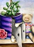
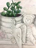
The different lines and textures used really add more to the piece. The objects drawn were given dimension very well. The colors used for the teddy bear’s shirt adds emphasis in a great way. Overall , this project gives the viewer an alive and expressive feeling.
- Natalie(fan) on April 28, 2023
I really like this art work that you drew. This art work looks very nice with the 2 heads and the spiraling back ground. I like how the black and brown contrasts with each other. Overall great job.
- Dhruv(fan) on April 28, 2023
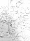
This art piece is a creative example of utilizing metamorphosis from a clip to an animal. The execution of the artist's vision in this assignment is clearly projected through each step, starting off with a simple clip to a detailed form of a tiger. I really like how the artist sees the clip as a roaring tiger rather than drawing it in a static posture face on. The opened mouth is a unique idea which demonstrates a sense of force and power which the audience might not have identified at first glance of the clip.
- Misha on April 26, 2023
The creativity in this peace is very prominent. It is easily seen because a simple binder clip is typically not envisioned into a large, fierce mammal. The progression in size throughout each drawing is also interesting to see all together. I like the fact that the deep shadows and highlights are easily seen from any angle.
- Amal on April 19, 2023
The drawing has a lot of depth in it. Each shape on the sides are shaded and casually gets lighter as it approaches the front. It’s very creative on how the bear has designs on its clothes. It was referenced well knowing that everything is realistic and has the same features as real life.
- Ephremia(fan) on April 19, 2023
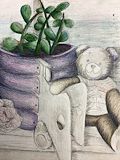
The transition from being a metal clip into a purple flower pot was very creative. The brown bear holding onto the metal clip creates an innocent atmosphere, one similar to the looks of a child’s bedroom. The red flower over to the left causes the audience to believe there to be more plants in the vicinity.
- Cesar on April 14, 2023
I admire this art piece because of the detailing, vibrant colors and realistic items. The shadowing of this picture creates the picture to look real. The vibrant colors such as purple, pink and green make the picture seem upbeat.
- Brooke on April 14, 2023
This colorful piece looks extremely realistic. It’s clear that many exquisite techniques were used to achieve this look of realism. The placing of the colors that contrast each other, such as the purple grapes in between the green apple and green, makes the scene more believable because it is more random and not perfectly laid out.
- Sunny on April 14, 2023
The creativity of the artist is clear through this unique composition. The attachment of the metal clip to the metal can is different but works well and adds diversity. The vibrant purple color of the metal contrasts well with the dull colors of the metal clip which enhances the piece and makes it pleasing to the eyes of the audience.
- Sunny on April 14, 2023
This composition looks very nice with the vibrance of the purple there. The way the shadows get darker and deeper is very impressive. The way you made the clip enlarges as it got closer helps add to the realism here.
- Kyle(fan) on April 13, 2023
I especially like how the proportions were done in this piece, specifically for the banana so the viewer can understand the point of view. The use of vivid colors is captivating and makes the viewer want a bite of the fruit as well.
- Megha on April 13, 2023
This composition is flooded with a clashing of several hues both warm and cool. With this method, the colors add an immense level of liveliness and conveys an exciting yet peaceful feeling as it contrasts from the simple background. The gradient values displayed on the teddy bear also do a fantastic job at revealing the differences between shadow and light.
- Rangana(fan) on April 13, 2023
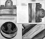
The line work in this piece is very impressive. The way a picture is illustrated with using lines going in different directions filling the entire page is really cool. The way their are more lines in some areas than others creating a difference between light and dark areas throughout the piece shows good value and contrast.
- Leila on April 12, 2023
I like the way you used darker hues to contrast with the lighter ones such as the indigo contrasting with the light brown. The small details like the flower and design of the teddy bear’s shirt make this piece more realistic. You did a great job accomplishing nostalgia in this piece.
- Monica(fan) on April 12, 2023
I adore the contrast you’ve perfectly done in your artwork. The shading creates so much texture and smoothness. You’ve also not made the outline dark so it also creates a real look in the eyes. Wonderful job!
- Gaia(fan) on April 12, 2023
The finished piece is absolutely stunning ! I am impressed with the variety of techniques applied in order to create a cohesive composition demonstrating the elements of design. The color palette used is extremely intense which creates a rhythm between the objects as well as flowing gradient to display the shadow to highlights. I feel that this art piece uses up an appropriate amount of negative space as there is a simple background but a deeper focus on the middle ground and dimension is effectively presented in the foreground using for shortening of the clip.
- Misha on April 12, 2023
I enjoy the way you shaded the objects in this piece. The shading illustrates believable lighting especially in the rose. One thing you could’ve done to improve this already great piece is you could’ve kept the lighting consistent on all the objects, for example the clip and pot are lit head on versus the teddy bear is lit from above.
- Param on April 11, 2023
I absolutely adore the use of colors in this piece. The light colors for the bear add to the innocent aesthetic and contrast with the deep purple of the pot. The use of shadows on the bear help convey its texture and the smooth shading of the leaves helps express its smooth feel.
- Amisha(fan) on April 11, 2023
The gradient made in the flower adds to the overall look. The lines in the wood make it look realistic. The overall detail in this piece is great and you can tell how much work was put in. Great Job!
- Danielle on April 11, 2023
The progress you made since your last post is immense. The bold colors in the pot and on the bear’s clothing are really interesting and eye-catching. The contrast between all the colors in the piece go well together and form an overall unified piece.
- Becca on April 11, 2023
This piece looks great. The way you utilize a multitude of hues and tones in every section of this piece give the piece gives it a realistic feel. I also like how you can see some of the stroke marks in every section in this artwork because it feels like it helps solidify the form of the object giving more depth to the artwork.
- Phillip(fan) on April 11, 2023
I love how the artist uses vivid colors. The shading on the fruit makes them seem very life-like and realistic. I like the Birds Eye view perspective.
- Samantha(fan) on April 11, 2023
I really enjoyed how you focused so much to add texture and what looks like crops hatching to the ground and all of the nature. Your technique of shadowing put emphasis on this piece to make it look like there’s some sort of natural light coming in through the landscape based off the ways it’s hitting the trees and the other objects in this piece. This all made this composition look very realistic and bring out a lot of real life aspects and then turned into a piece of artwork.
- Ava(fan) on April 3, 2023
The use of color on the plant's pot is very impressive, I like how you used cooler color tones. I also love how you inserted the clip into the plant to give it more sharp feeling. The shading and the range of colors used makes the piece really unique!
- Ava on April 3, 2023
I love how you used color to show where the light in your photo is. The inside of the pot has darker colors while the outside of your part is a mix of dark and light colors. It shows that the lighting in your work is showing on the front of the photo, and color that’s closer to the background is darker.
- peyton(fan) on April 3, 2023
The overall look is very pleasing. The imperfections of the bear make it more interesting. The vivid green colors used for the plant make it look realistic. Good job!
- Danielle on March 28, 2023
I really love the skills implemented in the execution of this composition in order to focus on the dimension of the objects. The feathering technique used to add color to the sketch is very effective in terms of eliminating thick lines and adding a more realistic demonstration of more prominent shadows and highlights. The feathering used for the teddy bear, really captures the texture and feel of the fur. My favorite part of this art piece is the creativity of the clip, it was really unique to make it the plant pot handle and further enhance the foreshortening of the clip end.
- Misha on March 28, 2023
This is really creative. The darkness of your lines give you teddy bear depth. I enjoy how there is no negative space in your drawing. From the flowers, the plant, the clip, and the teddy bear which makes your drawing very unique. Though the compositions seem simple the way you describe is very complex which means you put a lot of thought into how you placed everything.
- Kayla(fan) on March 28, 2023
Such a beautiful drawing! It’s amazing how sentimental it can become. The composition makes it peaceful and the contrast is great. It adds depth and dominance. Great work!!
- Gaia(fan) on March 22, 2023
I adore your work. The different types of shadings creates contrast. It allows the imagination to see what you’re trying to portray. Great work!
- Gaia(fan) on March 22, 2023
I really love how you added texture to make the ground look like grass and more realistic. I also like how you shadowed everything to make it look like there’s a light source. I like the texture you decided to use, it makes the art piece look more realistic.
- Olivia(fan) on March 8, 2023
I really love how you added texture to make the ground look like grass and more realistic. I also like how you shadowed everything to make it look like there’s a light source. I like the texture you decided to use, it makes the art piece look more realistic.
- Olivia(fan) on March 8, 2023
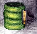
I think the artwork is effective because of how the green and yellow looks on the mug. Your artwork has a deep value and the shading is really good. Your art piece is amazing!
- Yecenia on March 8, 2023
I like the way you used different values in the colors and the background. The mug with the clip on it is really good. I like the bright colors on the mug.
- Luke on March 8, 2023
This art is very eye-catching. The shading gives this piece a new element and the green looks very pretty with the shaded background. The textures of the object is very creative and artistic.
- Ava on March 8, 2023
This piece does a great job of pushing the third dimension through your use of angles and shading. I love the use of lighting which is shown not only on the green but on the ground itself, emphasizing the direction of the light. The clip itself is well proportionate and helps convey the 3d effect.
- Amisha(fan) on March 8, 2023
The depth in the green and yellow hues adds texture to the mug. Also, the clip on the mug looks bigger than a normal clip which emphasizes the difference. The different values used like the dark yellows and light greens shows the various compositions.
- Kaavya on March 2, 2023
I love how you added a pencil on one of the hands! The black and white background really contrasts with the pencil. The way the hands almost blend in with the spiderweb-like background is awesome.
- Maya on February 24, 2023
The shadows of the piece provide an interesting feel of how the light is affecting the piece. The texture makes the entire thing more realistic, especially for the grass and other elements of nature present in the piece. The introduction of the foreground and background really brings everything to life.
- Evan on February 24, 2023
I like the creative vision of utilizing the clip as a mug handle. This art piece implements a strong focal point on the depth and density of the shadows as it brings focus to the mug’s bright color and form. The artist creates a dim and hazy atmosphere with the lighting and intense gray hues. Furthermore there is mild use of perspective as there is a line at the back which brings clarity to the surface underneath and behind the mug to push the object into the foreground.
- Misha on February 23, 2023
I love the amount of value you used in this piece with the dark and light greens. You also drew curved lines to make the pot a round shape. I can also see how you drew the shadow of your clip reflecting on to your background.
- peyton(fan) on February 22, 2023
This vibrant green mug stands out against the dark background. It is a pleasure to look at and I enjoy how the bright green color slowly fades and joins the dark background. This dimension makes me feel like the mug is within my reach.
- Anya on February 22, 2023
I like the different values added to show the curves of the object. The different colors also add more meaning to the art. The clip in the piece covers the blanks showing less open space.
- Shreya(fan) on February 17, 2023
Nice drawing, I like the colors used and how well you can tell what it’s
- Mitchelle(fan) on February 17, 2023
I really like the line work. It shows movement as if it was being captured in a photo. Displays a sense of realism.
- Leila on February 17, 2023
This artwork is very satisfying to the eye. It has deep value. I really like the shading that is taking place.
- Leila on February 17, 2023
I like how the clip is showing different colors, which give it dimension, values, and depth. Also, the background goes from light to dark, which really give the clip shadowing and make the picture look more natural. It also makes viewer feel like they are alone one on one with this cup and clip.
- Ayva on February 17, 2023
I love the different textures that you chose to create this art piece. I also like how you created thicker and thinner lines to create shadow and dimension to your work as well.
- Olivia on February 2, 2023
This piece is so interesting to look at. There are shadows to show where the light is coming from and the lines make sense to the art piece
- Leena(fan) on February 1, 2023
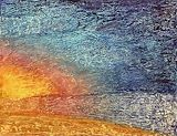
The even dispersal of values and hues was very well done on your part. The colors are able to successfully intermingle with one another to the utmost simplicity
- Rangana(fan) on February 1, 2023
You did a really good job evenly distributing texture throughout the sunset, everything looks very even and blended. The colors go really well with each other and blend together really nicely.
- Monica on February 1, 2023
I like the colors used, how it here shaded together, and the use of texture
- Shaina(fan) on February 1, 2023
I really enjoy how you used the textured background and incorporated it into your art. The sand looks very realistic because of the texture.
- Anya on February 1, 2023
I really enjoy hows you used the textured background and incorporated it into your art. The sand looks very realistic because of the texture.
- Anya on February 1, 2023
I really enjoy hows you used the textured background and incorporated it into your art. The sand looks very realistic because of the texture.
- Anya on February 1, 2023
I love the dramatic shadows on this piece which only add to its intensity. The use of the heavy contrast between the black and white only emphasize it.
- Amisha(fan) on February 1, 2023
I like the textures selected for this artwork. I also like how the sky gives light contrast to the image.
- Zoë on February 1, 2023
I love the different textures you incorporated. The different texture gave the art different value tones.
- Anya on February 1, 2023
The texture of this artwork is very unique. The colors also blend nicely.
- Zoë on February 1, 2023
The different techniques used create different textures and details. They add shadow, dimension, and emphasize where the light is coming from.
- Natalie on January 26, 2023
I really like this
- Isabella on November 26, 2022
the scenery in your art piece is beautiful and the colors you used made your art piece stand out
- brooke on November 12, 2022
the scenery in your art piece is beautiful and the colors you used made your art piece stand out
- brooke on November 12, 2022
The way your hands fit into the shapes as well as how the shapes mold around the hands is really interesting, with it almost seeming like everything blends together.