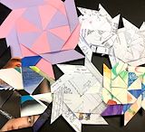
The album covers used as paper for the start is a really nice touch and creates contrast from the others. The pink and purple star is also very pretty.
- Briana(fan) on January 30, 2025
The Origami’s have a great variety of different pictures and patterns which Make some stand out from others. This helps create balance and gives it significant value, and emphasis on each of them.
- DJ Ragosa on January 30, 2025
All colors in this artwork are balanced and create unity. The green and red especially help create a contrast in this artwork and the background goes from a dark to light shade, depicting shadows and adding value.
- Matt(fan) on January 30, 2025
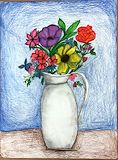
The flower has great texture and patterns that makes it stand out very bright, and unique. The colored flowers compared to the background creates great unity and emphasis on the drawing. Outstanding Work
- DJ Ragosa on January 28, 2025
It is a very nice drawing. Multiple colors and flowers which give it a very nice look to it.
- Diego on January 28, 2025
The blue from the butterfly pattern is balanced by the blue in the peacock feathers. The bright shades of colours emphasize certain parts of the artwork.
- Ria on January 28, 2025
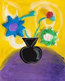
The contrast of the purple and yellow flowers adds a nice visual component to your bouquet of flowers. The sizes and spacing of the flowers make the bouquet balanced.
- Ria on January 28, 2025
The colorful flowers stand out against the blue background, making them the main focus of the artwork. The white vase adds contrast and helps keep the composition simple and clean.
- Brooke on January 28, 2025
I really love the use of color throughout this work! Everything is so different, but it doesn’t take away from the unity of finished product. I love how every piece of this is so vibrant.
- Deena(fan) on January 23, 2025
Your artwork is very colorful and I love the contrast between the different designs. The different patterns gives the illusion of texture on the page.
- Ridhini(fan) on January 23, 2025
This drawling uses a combination of different types of colors and textures to show the element of pattern and variety with animal patterns from different types of animals. The composition is balanced and it is engaging.
- Vivaan on January 23, 2025
The contrast of colors and patterns used to bring different animal skins together is done beautifully. The mixed mediums used to really make each individual skin blends the piece together.
- Kat(fan) on January 23, 2025
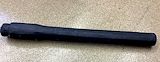
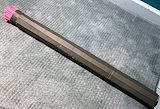
The paintbrush’s shape is well developed by the artist. Clean cuts and even measurements is why the paintbrush looks like the way it is. The black gesso is covered all throughout the paintbrush and there are very minimal white spots.
- Matt(fan) on December 18, 2024
The black gesso contrasts against the beige background of the floor. The plaster is smooth and compliments the shape of the paintbrush sculpture.
- Ria on December 18, 2024
The shape of the paintbrush is different than the other paintbrushes, with the balance of the circularness and roundness of the brush. It is very proportioned, and the color of the gesso really makes the brush stand out.
- DJ on December 18, 2024
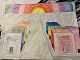
The sunset in the background makes the picture feel really peaceful and warm. The straight lines of the road and buildings make everything look neat and help guide your eyes to the sun.
- Sienna(fan) on December 16, 2024
The straight lines of the handle make the brush look really clean and balanced. The pink bristles add a nice pop of color that stands out and makes it more interesting!
- Sienna(fan) on December 16, 2024
The smooth texture of the brush handle contrasts nicely with the detailed bristles, creating a balance between simplicity and complexity. The elongated shape of the handle emphasizes unity and flow, making the piece feel cohesive.
- Sienna(fan) on December 16, 2024
This paintbrush is very well put together, which makes it look neat and professional. The pink as a second medium gives it a great stylish, and graceful texture to the brush.
- DJ on December 6, 2024
The pink paint on the bristles adds a nice contrast compared to the brown cardboard and emphasizes the top part of the paintbrush. The cut up cardboard for the bristles also add a nice texture to your sculpture.
- Ria on November 22, 2024
I like how she added lines to the word Emotions because it made it have more detail.
- Reeva on November 18, 2024
I like how she made the word museums 3d and filled it with many colors,making it stand out
- Reeva on November 18, 2024
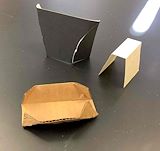
I like how she scored the cardboard and bent it in a 3d shape
- Reeva on November 18, 2024
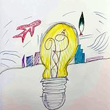
I like how the light bulb is shown as 3d with the buildings and airplane in the background.
- Reeva on November 18, 2024
I really love this it’s really organized and so neat and you can really see all the shadows
- Janely(fan) on November 18, 2024
The contrast of the colors makes the art very eye-catching. I like how you added movement to the background.
- Ria on November 12, 2024
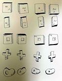
The shapes that you’ve created are very unique and have a lot of form.
- Ria on November 12, 2024
I like the background of this artwork. I also like the orange lines in the letters!!
- Matt(fan) on November 12, 2024
The spacing between your shapes helps keep your art organized and neat. I like how you’ve added depth to these shapes.
- Ria on November 12, 2024
The balance between the shapes helps the lightbulb standout. I like the colors used for the background because it helps create depth.
- Ria on November 12, 2024
The lightbulb is very extravagant, and it brings out the drawing very well. The buildings being very small, makes the center piece of the artwork even bigger and more noticeable.
- DJ on November 12, 2024
The balance between the shapes helps the lightbulb standout. I like the colors used for the background because it helps create depth.
- Ria on November 12, 2024
The color in the background makes the actual work stand out and the pattern adds creativity to the work.
- Chandani on November 12, 2024
The contrast of color in each word and the added shadows make it stand out and unique.
- Chandani on November 12, 2024
The lines in the artwork help better organize the notes and illustrations making it visabley enjoyable.
- Chandani on November 12, 2024
There’s a lot of descriptive words being used, and it really brings out what you are trying to say.
- DJ on October 23, 2024
It is very well done, and the space is very filled in, which makes it excellent and very exceptional.
- DJ on October 23, 2024
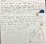
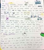
The images in between the notes add a better understanding of the art explained.